Sector:
Finance On the GO (FIGO
Client Ask:
- Need Real-time financial, inventory and market data access for all BU commercial and finance leaders.
- Need to reduce finance operational overhead on analysts allowing them to focus on business partnering and high value add activities
- Alignment on a north star vision for further exploration and development
My Role:
Meet the team:
UX lead, UX Designer, Visual Designer, System Architect, Customer Strategy & Process Leader.
12 weeks (before handoff to development)
Strategy Kickoff
# Design Thinking Workshop
We had an extensive fast-paced 2-day workshop with Medtronic’s main Stakeholders, CFOs, and Business Analysts to understand their vision mission, paint points, frictions, needs, and requirements. The goal was not to have an extensive discussion or to develop a perfect solution, but to make quick workflows, to get the commitment, and to be able to act strategically despite limited time and budget.
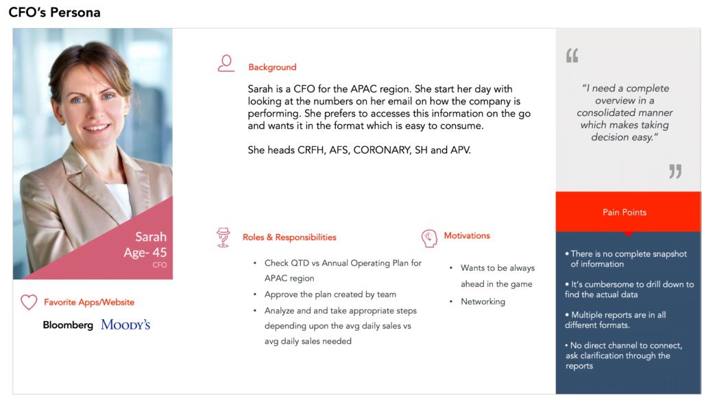
In order to empathize with the different types of users, we developed so-called proto-personas, which were based purely on experience and assumptions. These served as a starting point to reflect on the needs and challenges of the user and possible solutions that can be considered later in building the information architecture and experience.
Big Ideas and Prioritization:
Once we had our persona and empathy maps in place we captured the needs and pain points of CFO we brainstormed Big Ideas and conducted idea prioritization activities in terms of feasibility and value to users and carved the roadmap next steps.
Mapping the user’s mental model and Data Visualization
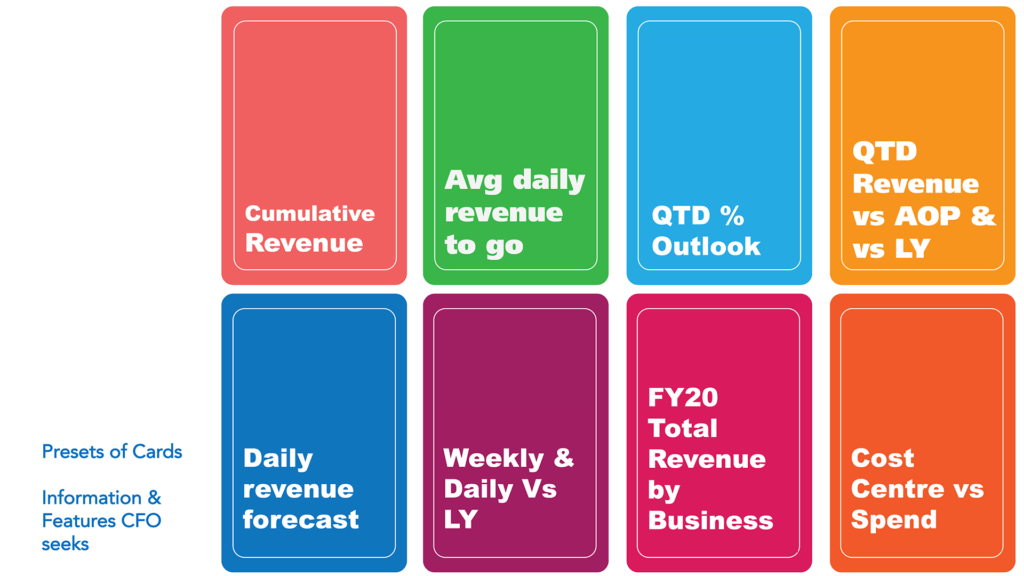
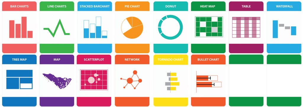
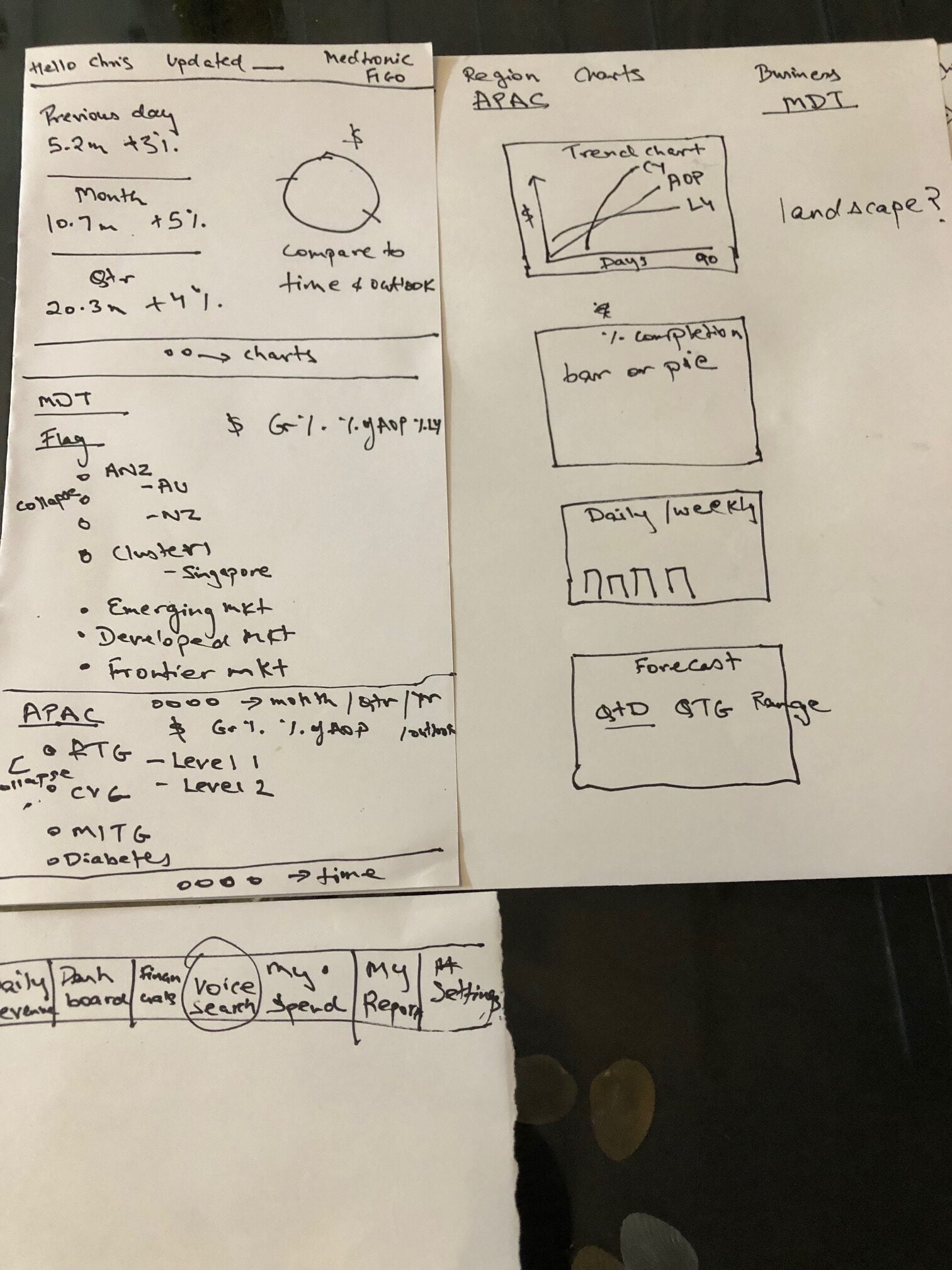
During the workshop, we mind mapping activities for Data Visualization. We created 2 sets of cards. One set of cards represented the user driven features and other set consisted of the different types of data visualization. The users were than asked to pick up a feature and map it with visual representation of the card of their choice. This worked very well in capturing the way these users wanted to see the data visualization for different modules and heloed us to map them back in our solution.
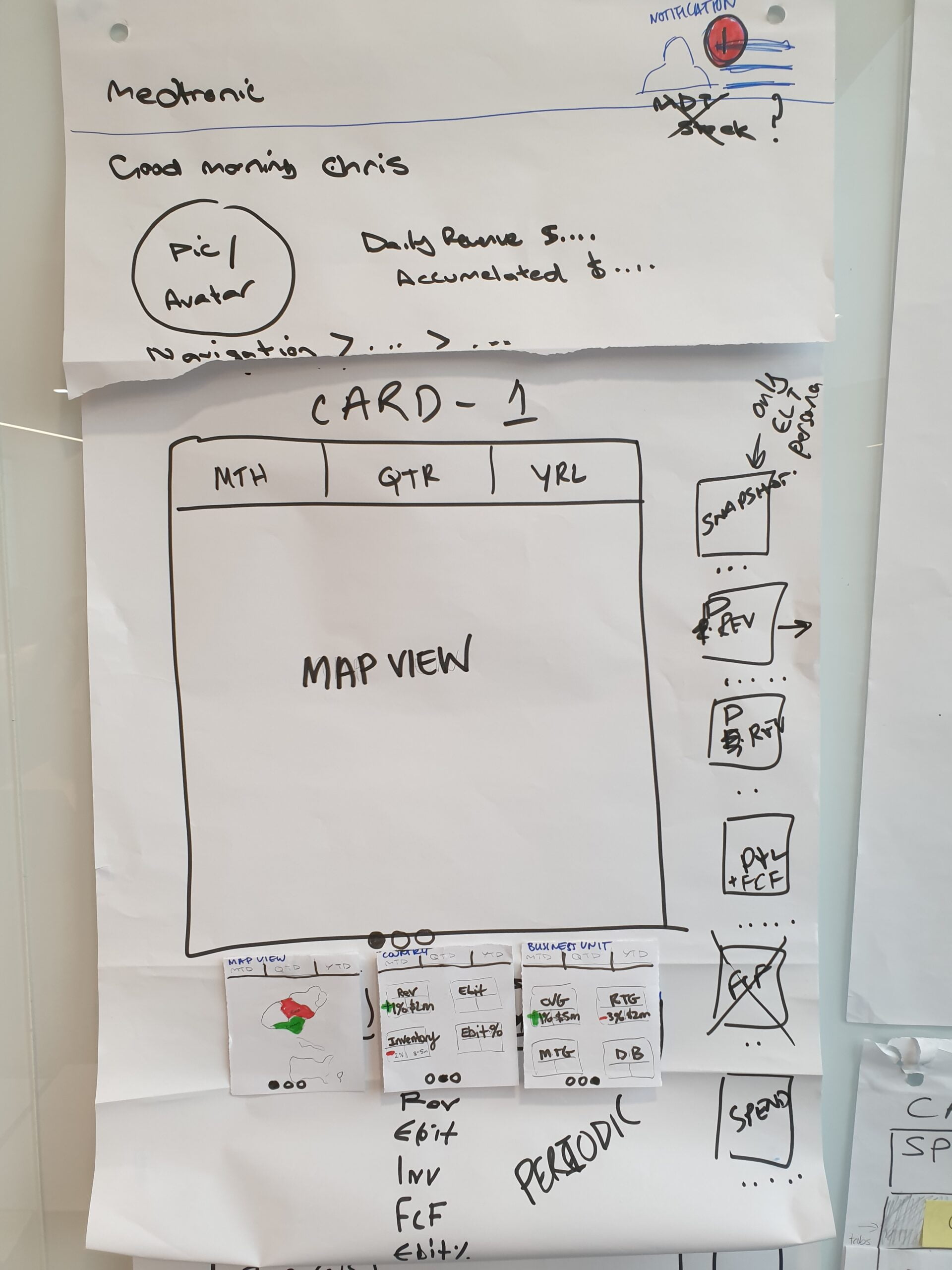
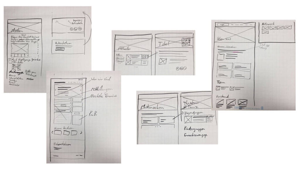
Brainstorming with paper prototypes:
Based on the prioritization grid and Mapping activities in the workshop, we flushed the initial design directions and stuck our paper prototypes at the highly visited Medtronic office. We left the paper prototypes for the CFOs to spend time on it and post feedback and further refined the same.
Research findings:
The 2-day workshop helped us in understanding the stakeholders and their needs. In this case, the main goal was to gather information for creating a way for CFOs to have financial health at their fingertips without the Business Analyst investing extensive hours to create the report. A few of the Key Insights are mentioned below:
- There is a huge dependency on analysts to generate reports.
- Lack of real-time reports resulting in suboptimal decisions.
- Information stored in disparate systems
- Business Analysts spent 10-15 hrs per week to generate these reports. They have to create separate PDF reports like Daily Revenue Report, Yearly Revenue Report, FCF Report, P & L Report, Spend report for business/sales leaders specific to the user’s region and BU access.
The Opportunity:
The 2-day workshop with Medtronic led to a partnership, where Medtronic engaged IBM in their digital transformation journey. The objective was to build a personalized reporting dashboard with access to real-time data on the financial health of various Medtronic Business units and reduce dependency on analysts to generate manual reports.
Project Goal:
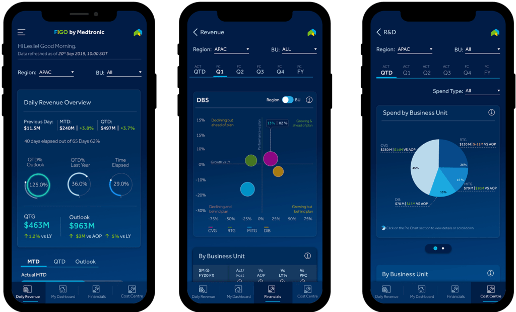
The goal of the project is to design an app that generates the below reports as per the specified schedule and allows the users to view them as needed and provide a way to export and download the reports
- Daily Revenue Report
- Periodic Revenue (Dashboard)
- Financials
- Cost Centre
# OUR APPROACH
Started with Virtual Design Thinking Workshop sessions to understand the vision of various stakeholders like Finance, Business, IT. During the session, we detailed out end to end journey of CFOs of each Business unit across geographies. Spent more than a week to immerse ourselves in their context and synthesized all the findings to the dashboard and visualized the hierarchy for Financial health based on the stakeholder role in the organization.
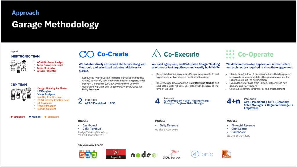
Followed by IBM Garage Methodology, we planned multiple Garage sessions with the team to understand the breadth and depth of the five modules that were going to define the mobile app. We schedule daily garages to Co-create, Co-execute and Co-operate.
Co-Create: In this phase, we Collaboratively envisioned the app along with Medtronic stakeholders. We conducted Design Thinking workshops to identify user needs and defined Personas (APAC president and CFO) and their journeys. We generated big ideas, prioritized them, and created tangible prototypes for Daily Revenue
Co-Execute: We used agile lean, and Enterprise design thinking practices to test hypotheses and rapidly design iterative solutions with the end-users. We further defined two more personas(Coronary Sales Manager + Regional Sales Manager) and created their journeys. We created task-based scenarios to validate the journeys with end-users. We successfully rolled out the first MVP version. We validated the solutions with 15 users to roll out our first UAT.
Co-Operate: We delivered scalable solutions and information architecture requires to drive the engagement. Initially which started as a 2 persona engagement was now extended to accommodate other personas across BUs throughout the organisation at APAC level. Expanded the user base from 50 to 500 to include a wider audience across Medtronic.
# Learning
In retrospect, I feel the initial 2-day workshop helped the IBM team and Medtronic team to align on the experience of the app. It helped to shift the conversation from one about features and functions to one about users and user outcomes. this aided us in delivering more useful, usable, and desirable solutions. It helped the design team to quickly create and iterate on ideas and build meaningful solutions. But there was too much to be achieved in 2 days.
# Challenges
Once we handed over the designs to the development team, the design team was off-boarded and 1 designer was working for 20% to support the developers. This had screwed up the design towards the end of UAT. The client escalated the design quality issues and demanded changes in design.
# Resolution
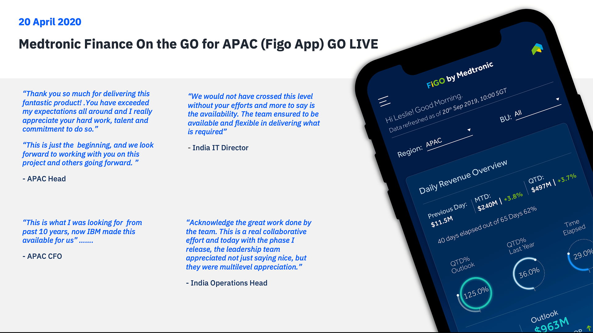
I was onboarded and tasked with resolving client escalation. I had to change the designs overnight with minimal development efforts. I did come up with a couple of changes and did quick validations with the end-users. It took ~3 to 4 days for developers to make the changes and viola we were up. in the game. The client loved the application
# Testimonial
Information Architecture
Based on the insights gained from the initial workshop and Card Sorts with potential users, we defined the sitemap for FIGO and evaluated it with 15 users.
Data Visualization
Since this was a greenfield project in the Medtronic ecosystem we had to start from scratch. We did extensive research to understand different types of graphs and data visualization techniques. We explored sample projects in Power BI and Tableau to get an understanding of how the users perceive these graphs.
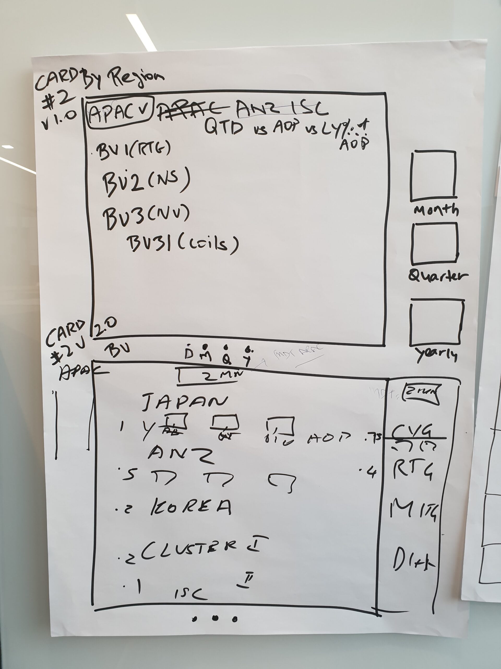
Moving from Low Fidelity to Medium & High Fidelity
After some paper prototyping adjustments, wireframes, mid-and high-fidelity prototypes were created, which were supplemented with clickability using Adobe XD. Again, user tests revealed small vulnerabilities in the interactions & graphs represented in some modules. In addition, the users asked smart questions, which led to further improvements.
Learning
In retrospect, that was too much for the same 2-day workshop, as the focus faded due to too many technical discussions. Nevertheless, the few we had completed were helpful as a starting point for the design phase, and after that, only very small concept changes were necessary.
In the future, I will try a different approach – inspired by the 2-day workshop format – in which each person creates sketches of each main screen, followed by a comparison of the various approaches, and finally the creation of a best-of version. I prefer it because this way you go from quantity to quality. Also would want to have a separate workshop for Technical discussions and alignment.
Final App Design
Learning
#1 Big challenges require small steps
Take small steps, because big changes can not be brought overnight, especially not just by an application alone. Accordingly, develop more strategically meaningful and realistically applicable tools that steer in the intended direction
#2 It takes courage to accept mistakes.
Be open to challenging situations, accept the flaws, and do course corrections. It is OK to make mistakes. More important is to accept mistakes and rectify them
#3 Together we win.
We fail and succeed as a team. it takes a team effort to successfully deliver the project The project wouldn’t have been a success without the developer’s cooperation.
#4 Everything that glitters ain’t gold.
There were a lot of fascinating and complex graphs in Tableau which initially lured us to have them in our designs. But surprisingly what we learned they were the ones that were more difficult to comprehend as well.
Conclusion
Digitization can revolutionize the entire organization’s way of working. In this case, Medtronic APAC CFOs use to browse 190-page PDF documents to understand the financial impact across the Business line. IBM empowered CFOs across 20 regions, and 5 business units to take any action on real-time data across various Financial parameters. We personalized the Dashboard based on the roles of each CFO. We have changed the landscape of how reporting and analysis would happen by reducing stress on the internal team who used to manually consolidate reports spending around 10-15 hours a week which is now completely automated